
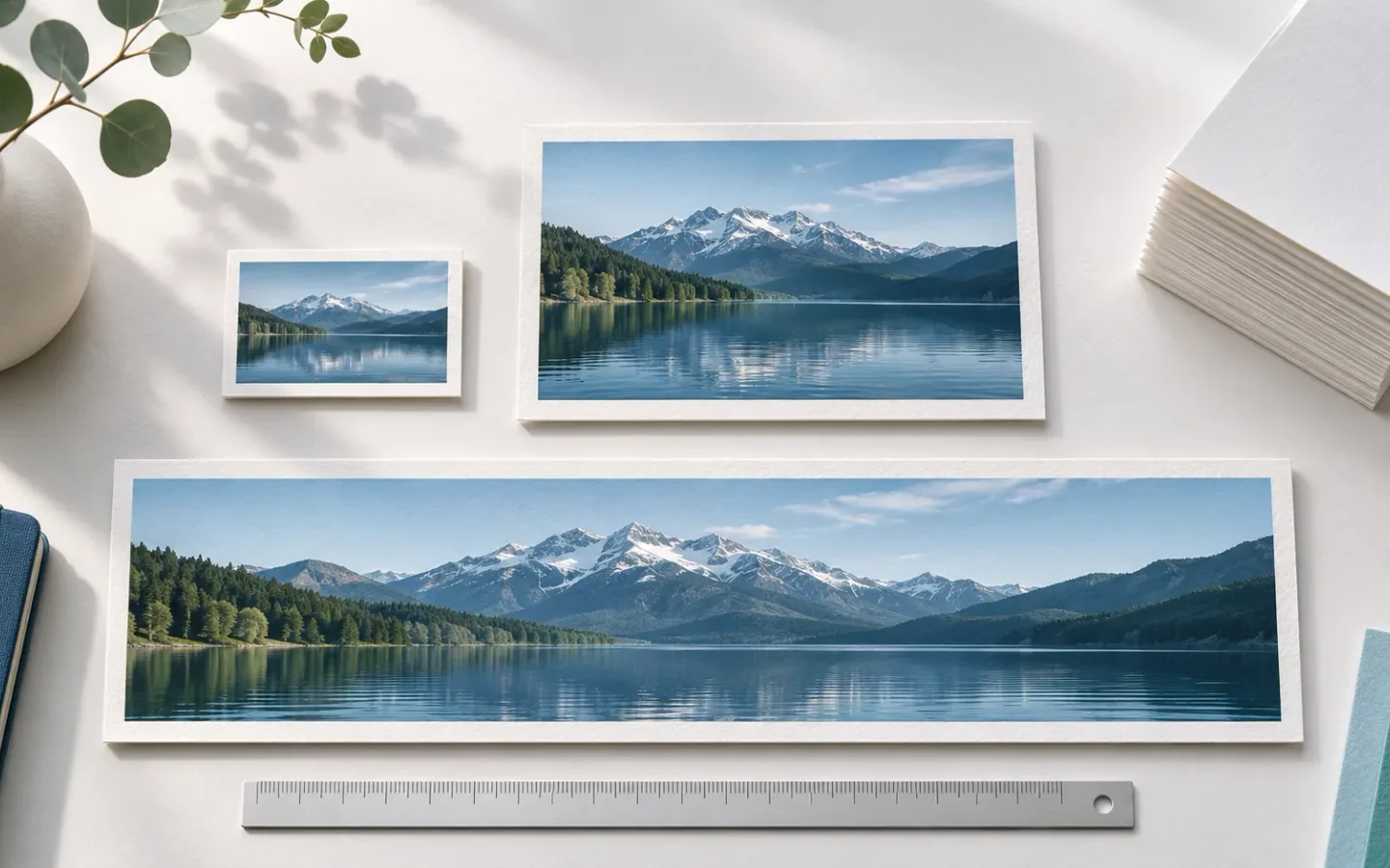
The right image size for SEO starts with the space the image fills on the page. A wide hero, a narrow article column, and a small card do not need the same file. Yet many publishing guides prescribe one width or one file-weight limit for all three. That shortcut can waste bytes on a phone or blur a chart that readers need to inspect.
The real task is to choose a crop, supply enough pixels for the rendered slot, encode a file that still looks good, and let the browser select a suitable variant. In a web development discussion about large portfolio images, the question was how to keep large visuals sharp without a heavy page. Another responsive-image thread asked whether declaring width and height defeats responsive delivery. These are practical questions. Neither has an answer that fits every image in a single KB number.
What Does Image Size Mean on a Website?
Four measurements often get called “image size.” Pixel dimensions describe the source file, such as 1600 by 900 pixels. Rendered dimensions describe the CSS box on a page, perhaps 720 pixels wide in an article. Aspect ratio describes its shape. File weight is the number of bytes transferred over the network. Each measurement can change independently.
Imagine a 1600-pixel-wide photo shown at 360 CSS pixels on a phone. CSS can shrink its display box, but if the browser downloads the 1600-pixel file, the transfer still includes that file’s bytes. A narrower encoded variant can reduce the transfer. Conversely, a 360-pixel source stretched across a wide desktop banner may look soft. Responsive delivery addresses both cases by offering several source widths.
File weight does not follow width in a simple straight line. A smooth illustration can compress well, while a detailed photo of tree branches may need more bytes at the same dimensions. A screenshot with tiny text can become unreadable before its file looks “small enough.” A transparent graphic may need a format that preserves its edges and alpha channel. Judge the output in its final context, not by an arbitrary number in an upload dialog.
Why Can a Larger Image File Be Lighter?
Encoding controls how much information the file retains and how it stores it. Format, quality setting, source detail, and metadata all affect bytes. A larger, simple image encoded efficiently can weigh less than a smaller, noisy one. This is why “resize every image to 1200 pixels” is not a complete performance plan. Measure dimensions and transfer size separately, then look at the rendered result.
The first-party cover for this article is a concrete example. The source visual was prepared at 1672 by 941 pixels and encoded as WebP at about 135 KB. Those values describe this cover file, not an ideal target for all pages. An article chart with labels may require a different format or more pixels. A thumbnail can use a smaller generated variant of the same source.
How Do You Choose Pixel Dimensions for a Page Slot?
Measure the image box in the actual layout at narrow and wide viewport widths. Use browser developer tools or the design’s CSS to record the maximum rendered width. Then choose candidate source widths that cover the slots you intend to serve. A dense display may benefit from more source pixels than the CSS width alone, but do not assume every image needs the highest possible density. Inspect whether extra pixels make a visible difference at normal reading distance.
For an illustrative calculation, suppose an article image appears at 680 CSS pixels on desktop and 340 CSS pixels on a phone. You could prepare variants around 400, 800, and 1400 source pixels wide. The browser may choose a higher-width variant for a high-density display. These are example sizes, not a Google requirement or a promise that every browser will request the same file. Measure the real request in your own layout.
Preserve the image’s aspect ratio while resizing unless the design intentionally needs a crop. If you force both width and height into a different ratio without cropping, circles turn oval and people look stretched. The image resizer is useful when you have the right composition and need a smaller pixel copy. Make a new output so you keep the source for other placements.
Do Width and Height Attributes Fix the Display Size?
HTML width and height attributes can tell the browser the image’s intrinsic ratio and reserve space before it loads. CSS can still limit the visual to the container. The attributes do not force the browser to download a giant file, and they do not replace srcset or sizes. A useful pattern is to declare the source ratio and apply max-width: 100% and height: auto in CSS. This reduces layout jumps while letting the picture shrink on narrow screens.
If a card crops the picture through CSS, declare an appropriate aspect ratio for the card or use a real crop. A reserved ratio that differs from the final rendered shape can still shift content. The markup should describe the layout you actually ship.
When Should You Crop Before Resizing?
Cropping is a composition decision. Resizing changes the number of pixels but keeps the scene. Suppose a portrait of a ceramic mug has generous space above the subject. A square card cut from the center might lose the handle, while a wide header may leave the mug tiny. Choose the frame for each slot first, then resize that frame to the required source widths.
Use the image cropper when the subject needs a new frame. Check the subject at the smallest rendered size, where a face or product detail can disappear. For a chart or screenshot, crop away empty browser chrome but keep axes, labels, and context needed to read the graphic. Do not crop a diagram so tightly that the caption becomes its only explanation.
When a design uses the same image at several shapes, consider separate art-directed crops rather than one source mechanically squeezed into all of them. A card may need a close view. An article body can show the full context. A wide header can use a landscape frame. Each variant should still have an accurate alt text and a stable file URL. This is a content choice as much as a performance choice.
How Can You Tell Whether a Crop Is Too Aggressive?
Open the page at the smallest breakpoint and read it as a visitor would. If the important object is cut off, if a person appears without enough context, or if a chart’s labels vanish, restore more of the source. A crop that looks clean at full resolution can fail in a dense card grid. Check both the visual and its nearby text so the page does not claim something the cropped image no longer shows.
How Do You Reduce File Weight Without Losing Useful Detail?
Start with the right dimensions. Sending a full camera original to a small card and then applying heavy compression asks the encoder to keep detail that the card will never show. Export a properly sized copy, then test format and quality. Inspect the result at the page’s normal display size and at a close view if the user needs to read detail.
For a photograph, compare JPEG and WebP outputs from the same source and crop. For a text-heavy screenshot, pay close attention to small letters and thin lines. For a transparent logo or diagram, check edges and transparency against the actual page background. A format is a choice to test, not a guarantee that it will win on every source. Google’s image optimization guidance recommends good quality images while considering speed, and web.dev’s image performance guide explains why format and responsive delivery both matter.
The image compressor helps compare quality settings. The WebP converter helps test another output format. Keep a copy of the source, record the settings, and compare bytes and appearance. If a converter increases file weight or damages text, use another setting or retain the original format. “Modern format” is not a substitute for seeing the delivered file.
Should Every Image Be Under 100 KB?
No universal 100 KB rule appears in Google’s image SEO documentation. A tiny icon may be far below that number. A full-width editorial image with fine detail may need more to serve its purpose. Page speed depends on all resources, their loading order, caching, and the visitor’s connection. Use page measurements to decide where extra bytes matter, especially for the image that appears first. Do not erase useful evidence from a research chart merely to meet a round number.
The same point applies to “always use 2x.” Extra source pixels can improve a high-density display, but they also create a larger candidate file. Serve a set of variants and let the browser choose based on the declared slot and device conditions. Verify its selection in developer tools instead of assuming the largest file is needed everywhere.
How Do srcset, sizes, and src Work Together?
srcset lists available image files and their intrinsic widths. sizes describes how wide the image slot will be under different viewport conditions. The browser combines those values with device conditions to choose a source. src provides a real fallback URL and a crawlable image source. Google’s image SEO documentation specifically calls for discoverable images in HTML, including a valid src in responsive markup.
This example assumes three real, same-composition files exist. The paths and widths are illustrative. The sizes value says the image fills the viewport below 48rem and otherwise occupies at most 680 CSS pixels.
<img
  src="/images/workshop-800.webp"
  srcset="/images/workshop-400.webp 400w,
          /images/workshop-800.webp 800w,
          /images/workshop-1400.webp 1400w"
  sizes="(max-width: 48rem) 100vw, 680px"
  width="1400"
  height="875"
  alt="A ceramic mug on a workbench beside a ruler"
>
The width and height preserve the source ratio. They do not state that the browser must render the image at 1400 CSS pixels. If the layout adds 24 pixels of padding on each side of a phone, a more precise sizes rule can subtract that space. Start with a correct approximation, inspect the chosen request, and refine it when the page shows a meaningful mismatch.
In a Reddit thread about srcset and sizes, a developer saw unexpected image requests. That confusion is common because the browser’s choice also involves cache, viewport, and device pixel ratio. A test can look wrong if you resize a window after the page has loaded and assume the browser must switch down to a smaller file. Use a fresh load and inspect the Network panel and the image’s currentSrc property at each viewport.
When Do You Need a <picture> Element?
Use <picture> when you need art direction, such as a close mobile crop and a wide desktop crop, or a format source with a fallback. Keep an <img src> inside it. For a simple set of widths with the same composition, srcset and sizes on <img> are often enough. Do not add a complex format matrix unless it solves a real layout or transfer problem.
How Do You Check the Published Page?
Inspect the rendered HTML first. Confirm that the image appears in a real <img src>, the URL returns a file, the alt text fits the visual, and the page explains why the image matters. The image SEO checklist covers those discovery and context steps. A perfectly compressed file cannot compensate for an image that a crawler cannot fetch.
Next, test a narrow and a wide viewport. In developer tools, record the CSS width, currentSrc, intrinsic dimensions, transferred bytes, and whether the image stays sharp. Reload after changing viewport size so the request reflects the new condition. Use a throttled connection if you need to understand the first view. The browser may choose a file that is larger than the CSS slot because the display has a higher pixel density. That is expected if the chosen file improves visible detail.
For an important page, run PageSpeed Insights or Lighthouse and inspect field data where available. An image can affect Largest Contentful Paint when it is the main visible content. Below-the-fold images should generally load lazily, while the main above-the-fold image may need prompt loading. Google’s page experience guidance is clear that good Core Web Vitals do not guarantee top rankings. Treat speed as a reader benefit and a technical quality check, not a fixed position calculator.
If the field result and a single Lighthouse run disagree, follow the Core Web Vitals diagnostic workflow to separate the affected URL group from the lab trace.
Keep a short change log: old and new file URLs, crop, pixel widths, format, settings, page URL, and test date. If a CMS or CDN rewrites files, compare the final public resources, not only the uploads. A clean source file can become a heavy served file if a transformation rule is misconfigured. Conversely, build-time optimization may already provide variants, so manual compression might add little.
Frequently Asked Questions About Image Size for SEO
Can CSS Resizing Replace a Smaller Source File?
CSS changes the display box. It does not by itself reduce the downloaded file. Use responsive sources or an image service to serve a smaller encoded copy where that saves meaningful bytes. Check currentSrc and the Network panel to confirm what the browser received.
Does WebP Always Beat JPEG or PNG?
No. The outcome depends on the source, encoder, quality setting, and whether transparency or sharp text matters. Export candidates and compare their visual result and transfer size. Keep the format that works for the actual asset and browser support you need.
Can One File Serve Both a Card and a Hero?
It can, but it may waste bytes in the card or look soft in the hero. If the aspect ratios differ, separate crops usually communicate the subject better. If only the widths differ, responsive variants can share one composition.
Should the Main Image Load Lazily?
Usually avoid lazy loading an image that is immediately visible and likely to be the largest content on the page. It can delay the first useful view. Lower page images are better candidates for lazy loading. Test the actual page instead of applying the same loading attribute to every image.
Will a Smaller File Improve Google Images Rankings?
It can improve delivery and user experience, but no fixed ranking gain follows from a byte reduction. Google needs to discover and understand the image, and search results depend on more than file weight. Measure the page and Image Search results separately.